
Your subscribers decide within seconds whether they want to read your Email or ignore it. And one of the first things they notice is the design.
In fact, studies show that nearly 94% of the first impression of an email comes from its visual design. A cluttered or confusing layout can quickly push readers away, while a clean and appealing design can encourage them to keep reading and click through.
Despite this, many marketers still send emails with poor layouts that distract rather than guide the reader.
The good news is that creating visually appealing emails doesn’t have to be complicated.
In this article, we’ll share three simple email design best practices that will help you create emails that not only look great but also drive more engagement and clicks.
Start converting smarter with Juvlon.
Get the layout right
Above everything else, it’s an email’s layout that decides its overall look and feel. An email’s layout determines how the messaging will be laid out in the email and what users will see first.
Email content that’s been laid out well instantly draws the attention of the recipients to the intended elements — for example, it helps people spot the discount being offered or helps them check out the new product being launched and so on.
But surprisingly, many email marketers don’t pay any attention to the layout. Instead of choosing a layout that puts the spotlight on the desired actions from subscribers, they use layouts that distract the subscribers away from the main email goals.
So what counts as a good email layout?
There’s no one single email layout that works for every kind of email. For example, a monthly company newsletter has a lot of information to share. For instance, three articles from the blog, two product update notifications, a message from the founder and so on. The goal of such an email is to engage the subscriber and get to the click on the read more links. For such an email, a multi-column email layout would work the best, given the volume of information.
Likewise, for an eCommerce email promoting multiple products, again, a multi-column layout would work the best.
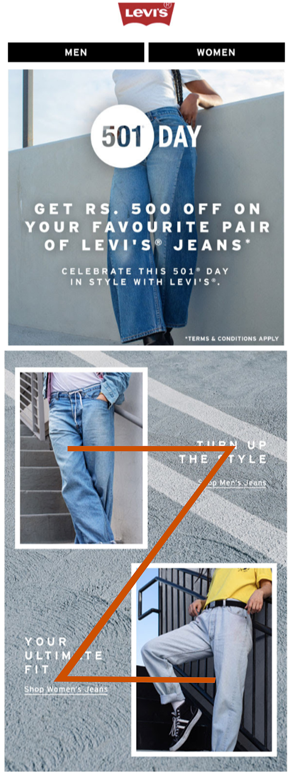
Take for instance this email from Levis — a top fashion brand. Because the goal of this email is to encourage its subscribers to explore its products, it uses a two-column layout. The email looks great and strikes a great balance with minimal bold text and elegant images to highlight lifestyle and clothing. It also uses a bold CTA button at the end.
If you pay a little more attention, you’ll also see that the email uses the “Z” layout, which is known to help readers/viewers process information quickly and easily.
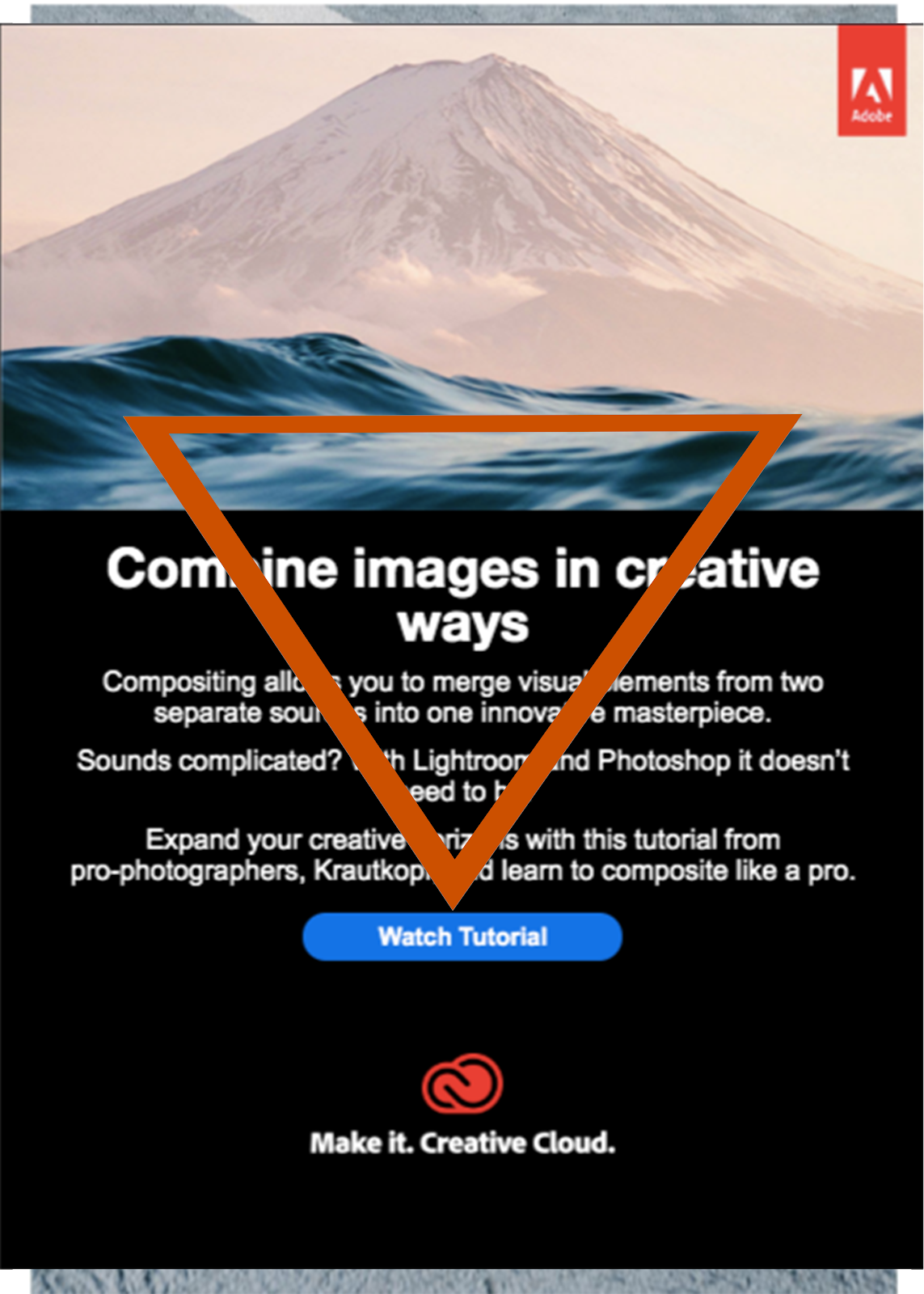
Now compare it to Adobe’s email shown below. This email from Adobe’s is a simple email that wants its subscribers to watch the tutorial it shares. And so, based on the email’s goal, the email that uses a single column layout and some short, quick copy before introducing its CTA button. It doesn’t use multiple-columns or images. It’s concise and pretty to-the-point. Also, it uses the inverted pyramid design principle to bring the readers’/viewers’ attention to the CTA button.
Use images that connect
Human brains process visual information 60k times faster than text. This applies to emails as well. An email platform analyzed over 5,000 campaigns that included a variety of emails like newsletters, promotional emails, automated messages and more and found that campaigns with images had a 42% higher click-through rate than campaigns that didn’t use images in the emails.
And there are multiple stats to show this. At Juvlon, too, we’ve found that emails with images tend to do better than those without.
But to add value to an email, an image must feel like a key part of the email message and not like an addon that feels out of place and distracts rather than engage.
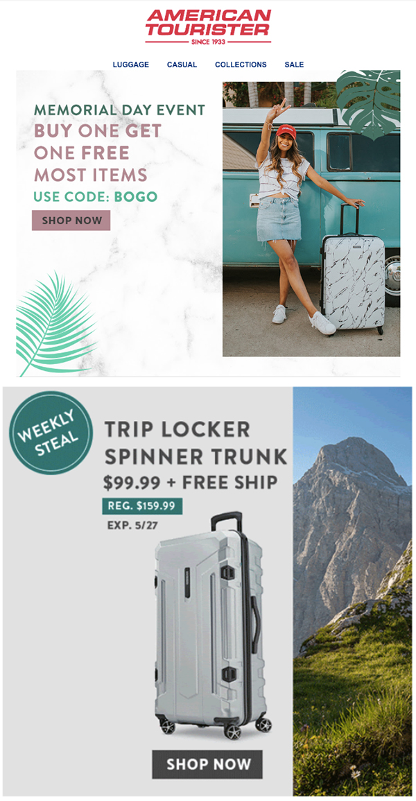
Let’s take an example. Below, you can see a beautiful email from American Tourister, a luggage brand. In the email, you can a number of engaging, high-quality images of its products paired with some brief text to help subscribers understand the message and buy. Now, notice the images:
The first one shows a carefree tourist who’s enjoying her journey with her compact and easy-to-move American Tourister luggage.
And the second one shows a sturdy bag and how it can stand even the most rugged and tough usage.
As you can see, these images don’t just add value to the email but also engage in ways not-to-obvious.
Add whitespace to highlight your message
Another key element of a beautiful image is whitespace.
Whitespace isn’t just a design element, it’s actually a very important tool that helps organize content, images, graphics, and other elements in design so that the readers/viewers can easily spot what you want to them to spot.
It helps you make your message shine and make your subscribers understand it. Besides, it also enhances the aesthetics, readability, and looks of an email.
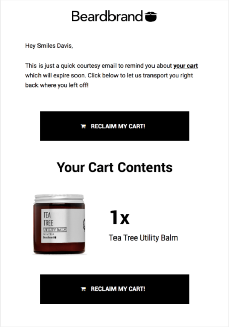
Here’s an example of an email from Beardbrand that uses a lot of whitespace in its cart abandonment email. The email looks clean and uses whitespace quite effectively as a cue to move the readers’ eyes to the CTA button.
Wrapping it up
The right layout, images, and whitespace will help make your email message pop… but it’s also important to get the stuff like branding, typography, and colors right. These are those little things that make a big impact on how your email looks and how relatable and readable it is. So pay attention to these as well.
Also, always review how your emails look on tablets and mobiles before hitting the “SEND” button but more than half of all emails are opened on these devices.
With an email platform like Juvlon, in addition to a drag and drop email builder, you also get many ready-to-use responsive email templates. These templates follow the best layout and design practices and are optimized for your email campaigns’ goals. They also look great on both desktops and mobile devices. Register for a free Juvlon account and instantly access these winning email templates and kickstart your campaigns.